
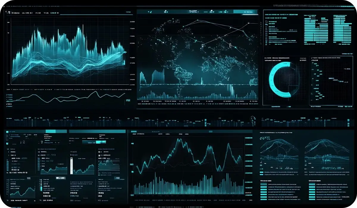
Data visualization in healthcare is becoming an essential tool for modern medical organizations. As the volume of healthcare data grows, the need for efficient ways to analyze and interpret information becomes more urgent.
The global healthcare data analytics market is valued at approximately $70 billion to $81.9 billion in 2026, and is projected to expand rapidly to nearly $193 billion to $213 billion by the early 2030. At the same time, more than half of healthcare organizations worldwide have prioritized data integration as a key technology investment.
The widespread adoption of healthtech solutions during the pandemic led to an unprecedented increase in digital healthcare data. With vast amounts of patient records, diagnostic reports, and operational statistics now available, healthcare organizations must find ways to make sense of this information. Data visualization tools help medical professionals extract key insights, recognize trends, and make informed decisions that improve patient care and operational efficiency.
This article will explore the definition of healthcare data visualization and discuss key benefits with real-world examples.
What is Healthcare Data Visualization?
Healthcare data visualization transforms complex medical data into easy-to-understand visual formats like charts, graphs, tables, and infographics. With healthcare systems constantly collecting vast amounts of data from electronic health records (EHRs), remote monitoring devices, hospital management software, and IoT devices, turning raw data into clear visuals is essential for improving decision-making and patient care.
Why is Data Visualization Important in Healthcare?
Why Is Data Visualization Important in Healthcare
Medical professionals work in high-pressure environments where quick, informed decisions can significantly impact patient outcomes.
Healthcare data visualization simplifies massive datasets, allowing doctors, nurses, and administrators to:
- Recognize patterns and trends: Identify spikes in disease outbreaks, patient recovery rates, or operational inefficiencies.
- Make faster, data-driven decisions: Healthcare teams can instantly interpret key insights instead of sifting through endless spreadsheets.
- Improve communication: Visual data helps medical staff, administrators, and patients understand complex information more easily.
Large datasets can be overwhelming and difficult to act upon without effective visualization. However, with the right tools, healthcare professionals can extract meaningful insights from diverse data sources, EHRs, laboratory reports, billing systems, and more, improving efficiency and patient care.
Diverse Data Sources in Healthcare
Healthcare data comes from multiple sources, each providing valuable insights into patient health, treatment effectiveness, and overall system efficiency. To maximize the value of this information, healthcare providers must integrate and visualize data from different origins, ensuring accuracy and accessibility.
Electronic Health Records (EHRs)
Electronic Health Records store comprehensive patient information, including medical histories, treatment records, diagnostic results, and demographic details. These records offer a complete view of a patient’s health, making them essential for long-term studies and population health management.
A structured format, often following the FHIR (Fast Healthcare Interoperability Resources) standard, allows EHRs to be effectively visualized. Medical professionals can use dashboards, timelines, and comparative charts to track patient progress, identify trends, and make informed clinical decisions. However, EHR systems often struggle with standardization and interoperability between healthcare providers and institutions. Without seamless data exchange, healthcare organizations may struggle to analyze information efficiently. Addressing these challenges is critical to improving patient outcomes and operational efficiency.
Wearables and IoT Devices
Wearables and Internet of Things (IoT) devices continuously collect real-time health data, tracking metrics such as physical activity, sleep patterns, heart rate, and glucose levels. This continuous monitoring is particularly valuable for preventive care and chronic disease management, offering real-time insights that traditional medical records may not capture.
By integrating wearable data with EHRs, healthcare professionals can develop personalized treatment plans and empower patients to take a more active role in managing their health. However, the vast volume and variety of data these devices collect pose accuracy, privacy, and security challenges. Advanced processing and visualization tools are necessary to analyze and integrate wearable data into comprehensive patient records.
Laboratory and Imaging Data
Diagnostic tests, including blood work, genetic testing, pathology reports, and medical imaging techniques like X-rays and MRIs, provide essential insights into patient health. These data sources are fundamental for diagnosing conditions, planning treatments, and monitoring disease progression.
Visualizing lab and imaging data can significantly enhance early disease detection and treatment assessment. For example, color-coded lab result graphs help identify abnormal values quickly, while annotated imaging scans improve the interpretation of medical images. However, the complexity of this data requires advanced tools to ensure accuracy and clarity. Combining lab results and imaging data with other healthcare sources enhances diagnostic precision and introduces data integration and management challenges.
Applications of Healthcare Data Visualization
Healthcare data visualization plays a critical role in simplifying complex information, making it easier for medical professionals, administrators, and even patients to understand key insights. Various visualization methods help healthcare organizations track performance, analyze trends, and improve decision-making.
Interactive Dashboards
Dashboards are one of healthcare’s most widely used visualization tools, combining multiple interactive reports into a single, accessible view. These dashboards can be integrated into healthcare software with built-in data analysis features or developed as standalone reporting solutions tailored to organizational needs.
A well-designed dashboard provides a comprehensive overview of critical healthcare metrics, allowing users to monitor patient statistics, operational efficiency, and clinical outcomes. Hospitals and healthcare facilities often rely on dashboards to display real-time data on bed occupancy, staff distribution, and patient flow, helping administrators make quick, informed decisions.
There are three primary types of healthcare dashboards:
Operational Dashboards
Present real-time data for monitoring hospital performance, patient admissions, and workflow efficiency.
Strategic Dashboards
Analyze long-term trends, helping healthcare leaders assess financial performance, population health, and resource allocation.
Analytical Dashboards
Provide in-depth data analysis and predictive insights, assisting researchers and clinicians in making data-driven decisions.
The effectiveness of a dashboard depends on its clarity and usability. Overloading a dashboard with excessive information can make it challenging to interpret, while poor design will typically fail to highlight critical trends. An ideal dashboard is user-friendly, highlights key performance indicators (KPIs), and allows users to explore deeper insights without overwhelming them.
Interactive Applications, Websites, and Widgets
Interactive applications and websites enhance data exploration by allowing users to interact with visualized information in a meaningful way. Tools like interactive maps, real-time charts, and filtering options help users focus on relevant data points.
For example, the Institute for Health Metrics and Evaluation (IHME) provides an interactive website where users can explore global mortality rates and leading causes of death. Users can switch between maps and charts or filter data by country, age, and gender to gain specific insights.
Another example is the BBC COVID-19 statistics page, which presents case numbers, vaccination rates, and other pandemic-related data using interactive maps, infographics, and dynamic charts. These tools make it easier for the public to understand complex epidemiological data and track the progress of healthcare initiatives.
Infographics and Motion Graphics
Infographics simplify complex healthcare information, making it easily digestible for professionals and the general public. By combining text, icons, and graphics, infographics present data in a structured format that enhances comprehension and engagement.
For instance, Johns Hopkins University has developed infographics that summarize key statistics on breast cancer, including incidence rates, risk factors, and prevention strategies. These visualizations help communicate critical health information in a way that is accessible and informative.
Motion graphics, which are animated infographics, are commonly used in educational videos, healthcare awareness campaigns, and training materials. These animations enhance audience engagement and retention, making them an effective tool for explaining healthcare trends, treatment guidelines, and emerging technologies.
Heat Maps
Heat maps highlight variations and patterns within complex healthcare datasets using color gradients. These visualizations are particularly compelling in identifying areas of concern or disparities in health outcomes.
In healthcare, heat maps are commonly used to display:
- Geographic disease distribution: Mapping the prevalence of diseases across different regions to guide public health interventions.
- Hospital readmission rates: Identifying hospitals or areas with high readmission rates to improve patient care strategies.
- Clinical imaging data: Highlighting temperature variations in medical scans for better diagnostic accuracy.
- Patient outcomes by demographic factors: Analyzing treatment success rates across different age groups, genders, and socioeconomic backgrounds.
The success of a heat map depends on the choice of color scales and data granularity. Selecting intuitive colors ensures that healthcare professionals can quickly interpret patterns while adjusting the level of detail to enhance accessibility for a broader audience, including individuals with color vision deficiencies.
Time-Series Charts
Time-series charts are essential for tracking changes in healthcare data over time. By visualizing data points in chronological order, these charts clearly represent trends, anomalies, and patterns in patient care and public health.
Hospitals and research institutions use time-series charts to:
- Monitor patient progress throughout treatment, identifying improvements or potential complications.
- Evaluate treatment efficacy by comparing patient outcomes before and after receiving medical interventions.
- Track disease spread in real-time, helping public health officials develop timely response strategies.
Time-series charts also play a crucial role in predictive modeling. By analyzing historical trends, healthcare providers can anticipate future disease outbreaks, resource demands, or shifts in patient demographics. However, managing large datasets and choosing an appropriate time scale is critical for ensuring that the charts remain readable and actionable.
How Does Data Visualization Improves Healthcare in Real Life?
Healthcare data visualization plays a crucial role in improving patient care by optimizing operations and enabling better decision-making. By transforming complex medical data into clear, actionable insights, healthcare professionals can enhance patient outcomes, streamline workflows, and anticipate future challenges.
Improved Patient Care and Outcomes
Clinical data visualization streamlines everything. Satisfaction and overall healthcare outcomes become more efficient with clinical data visualization. By creating graphs and charts, healthcare providers can monitor patient satisfaction levels, identifying trends and areas for improvement.
- A graphical representation of satisfied and dissatisfied patients over time helps measure the effectiveness of healthcare services.
- Comparisons of patient satisfaction metrics across different months or years reveal patterns that may indicate service improvements or emerging issues.
- The breakdown of satisfaction levels by patient demographics, medical conditions, or treatment types allows for targeted enhancements in care delivery.
- Visualization of reported reasons for satisfaction changes helps healthcare teams address concerns and improve the patient experience.
Comprehensive Visualization for Medical Devices
Medical devices generate vast amounts of real-time patient data, requiring an intuitive and efficient user interface for healthcare professionals to interpret information quickly. High-quality medical data visualization enhances the usability and accuracy of medical equipment.
- Biosignal monitoring systems clearly display heart rate, oxygen saturation, and other vitals, helping physicians detect abnormalities immediately.
- Organic tissue scanning tools use diagrams and animated visualizations to provide detailed insights into a patient’s internal health, supporting accurate diagnosis.
- Customizable imaging controls allow physicians and technicians to fine-tune medical device settings, improving image clarity and diagnostic precision.
Improved Access to Data Insights
Data visualization tools integrated with Electronic Medical Records (EMRs) and Electronic Health Records (EHRs) offer healthcare professionals a streamlined way to access and analyze patient data. Interactive dashboards and reports provide a complete view of healthcare activities.
- Performance monitoring dashboards display the time spent on consultations, telemedicine sessions, and administrative tasks, helping healthcare teams optimize their workflows.
- Patient condition and treatment progress charts allow physicians to assess the effectiveness of medical interventions and adjust treatment plans accordingly.
- Healthcare professionals can generate detailed visual reports, print or share healthcare statistics, and provide more precise insights to colleagues and patients.
Trends and Pattern Recognition
The ability to analyze vast amounts of healthcare data through visualization allows medical professionals to uncover trends, correlations, and key insights that might not be obvious in raw datasets.
- Disease incidence patterns can be tracked over time, revealing whether cases are increasing, decreasing, or stabilizing.
- Symptom frequency analysis across different patient groups helps diagnose conditions more efficiently and identify risk factors.
- Healthcare data visualization helps correlate medical events with seasonal changes, gender differences, socioeconomic status, or geographic distribution.
- Adoption of new treatment protocols can be evaluated for their impact on patient recovery rates, identifying which methods yield the best outcomes.
- Predictive models based on historical data help forecast disease outbreaks, resource demand, and treatment effectiveness for future planning.
Customized Data Presentations for Various Audiences
Different healthcare stakeholders require tailored data presentations to extract relevant insights. Custom clinical data visualization tools allow organizations to present information in the most effective format for each audience.
- Healthcare investors and stakeholders rely on visual reports showcasing hospital performance, service efficiency, and financial data. Graph-based reports provide clear overviews of key metrics.
- Patients and the general public benefit from infographics that explain disease symptoms, prevention methods, and healthcare recommendations in an accessible format.
- Healthcare administrators and staff use internal reports to monitor hospital operations, patient admissions, and resource allocation trends, enabling informed decision-making.
AI-Powered Predictive Analytics
Advanced healthcare data visualization is no longer limited to current or historical data. AI-driven visualization tools enhance predictive analytics, enabling healthcare providers to anticipate and prepare for future developments.
- Machine learning models analyze historical trends to forecast increases or decreases in disease prevalence, helping public health officials plan interventions.
- Predictive analytics identify potential workforce shortages in hospitals and clinics, assisting administrators in staff planning and recruitment.
- AI-based simulations estimate the effectiveness of different treatment plans for various patient groups, allowing for more personalized and evidence-based medical care.
- Business intelligence tools analyze healthcare data to forecast financial and operational trends, supporting strategic decision-making for medical centers and private healthcare providers.
How to Implement Software for Healthcare Data Visualization
Implementing healthcare data visualization software requires a structured approach to ensure that medical data is transformed into valuable insights. Each stage of development plays a critical role in creating a system that improves decision-making, enhances patient care, and streamlines operations.
Determine the Problem
Understanding the need for clinical data visualization is the first step. Identifying the primary audience, whether hospital administrators, doctors, or patients, helps shape the solution’s design and functionality. Administrators may require high-level operational dashboards, while doctors need patient health metrics in real-time. The type of data being visualized, such as treatment outcomes, operational performance, or financial reports, should be clearly defined from the beginning.
The expected outcome of the visualization tool should align with the organization’s goals. To enhance patient monitoring, the system must enable healthcare providers to track real-time vitals and detect early warning signs. Hospital efficiency is improved by providing detailed analytics on resource allocation, patient flow, and treatment success rates. Clearly outlining these factors ensures that the software delivers meaningful insights.
Consider Custom vs. Ready-Made Tools
Choosing between a ready-made visualization tool and a custom-built solution depends on the organization’s needs. Off-the-shelf software may offer a lower initial cost and faster implementation, making it an attractive option for organizations with limited budgets. However, these solutions often have rigid structures, limiting customization and scalability. On the other hand, custom development allows organizations to design a solution tailored to their specific healthcare workflows.
A custom-built solution offers greater flexibility and long-term value. By developing visualization software from scratch, healthcare organizations can include only the necessary features, ensuring optimal performance and ease of use. Unlike ready-made tools that may have unnecessary features or integration limitations, custom solutions can adapt to evolving requirements, ensuring better alignment with healthcare operations.
Assess Data Quality
The accuracy and consistency of healthcare data significantly impact the effectiveness of visualization. Before building a data visualization system, organizations must assess the quality and reliability of their data sources. Medical data often comes from EHRs, data warehouses, and external APIs, each with varying levels of completeness and standardization. Ensuring data integrity is essential for generating meaningful insights.
Data availability and compatibility also play a crucial role in effective visualization. Organizations must verify that their data sources are accessible and structured to support seamless integration. Working with an experienced IT team can help address inconsistencies, clean up datasets, and establish a framework that ensures the visualization system operates smoothly.
Choose the Right IT Team
Developing healthcare data visualization software requires collaboration with an IT team with healthcare technology experience. Hiring freelance developers may be a cost-effective approach, but relying on a single specialist can lead to limitations in expertise, especially when dealing with complex healthcare data. Additional hires, such as designers and quality assurance testers, may be necessary, making the process time-consuming and difficult to manage.
Building an in-house development team provides better control over the project, but recruitment, training, and operational costs can be high. Outsourcing to an experienced healthcare software development company offers a more efficient alternative. A dedicated external team can provide expertise in system integration, security compliance, and user-friendly design, ensuring the visualization tool meets the industry’s technical and regulatory requirements.
Build the Data Visualization Solution
Once the development team is in place, the project begins with defining requirements and creating a structured scope of work. The design phase focuses on the user interface (UI) and user experience (UX), ensuring healthcare professionals can easily navigate and interpret visualized data. A well-designed interface enhances usability by presenting information clearly and avoiding unnecessary complexity.
After the design is finalized, the development team builds the visualization system, integrating it with data sources such as EHR systems, medical imaging platforms, and external databases. Security and compliance measures, such as encryption and access controls, must be implemented to protect sensitive patient data. Once the system is complete, quality assurance engineers conduct thorough testing to ensure stability, accuracy, and reliability before deployment.
Implement and Maintain the Software
Successful implementation requires continuous monitoring and refinement. After deployment, healthcare organizations must work closely with their software vendor to address technical issues, apply updates, and optimize system performance. Ongoing maintenance ensures the software remains compatible with evolving technologies and regulatory standards.
User feedback plays a critical role in improving functionality. By analyzing how medical professionals interact with the system, organizations can identify areas for improvement and introduce enhancements that increase efficiency. Regular updates, security patches, and usability improvements help ensure that the visualization software remains an effective tool for healthcare decision-making.
Develop Custom Solutions for Your Healthcare Data Visualization
Developing custom healthcare data visualization solutions is essential for organizations aiming to transform complex data into actionable insights. Tailored visualization tools enhance decision-making, improve patient outcomes, and streamline operations by presenting data in a clear and accessible manner.
At KMS Technology, we specialize in creating customized data visualization solutions that cater to the unique needs of healthcare organizations:<
- Customized Data Analytics Solutions: We design and implement data analytics tools that transform complex healthcare data into actionable insights, facilitating informed decision-making and operational efficiency.
- Advanced Data Management: Our expertise ensures the development of robust data management systems, enabling seamless integration, storage, and retrieval of healthcare data, which is crucial for effective visualization.
- Regulatory Compliance: We ensure that all data visualization solutions adhere to healthcare regulations such as HIPAA, maintaining data security and compliance throughout the development process.
Contact us today to discover how KMS Technology develops custom data visualization solutions that enhance your organization’s ability to interpret complex healthcare data effectively.
TAGS

Written by
Field CTO
Kaushal is Field CTO at KMS Technology, where he applies deep healthcare and engineering expertise to guide digital transformation, scale technology teams, and turn strategic roadmaps into business value.